User Interface - Custom Visual Components
Introduction
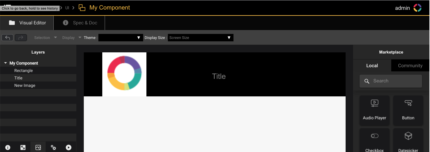
Custom reusable Visual Components can be created in a project.
Custom Visual Components can be edited the same way as a screen (using UI Editor).
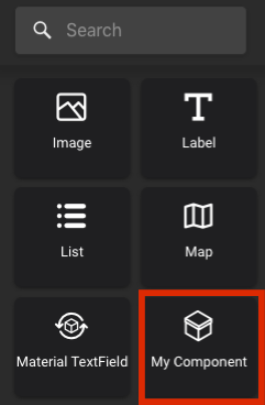
The custom UI Components is then available in UI Editor Marketplace when editing Screens or other custom Visual Components.
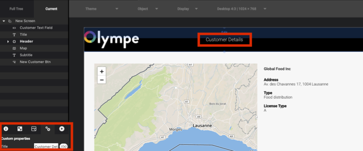
Custom Properties
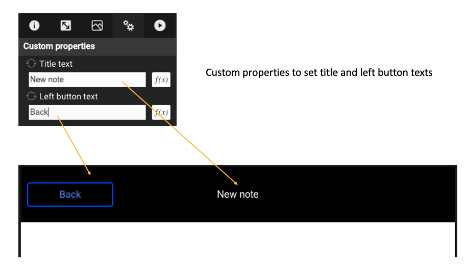
Custom Visual Components sometimes need custom Properties (in the example below, the header has custom string property to set its title)
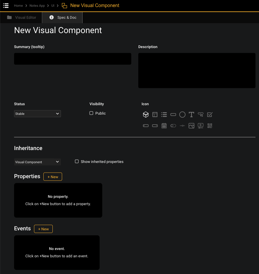
The property can be added in “Spec & doc” tab while editing the custom Visual Component.
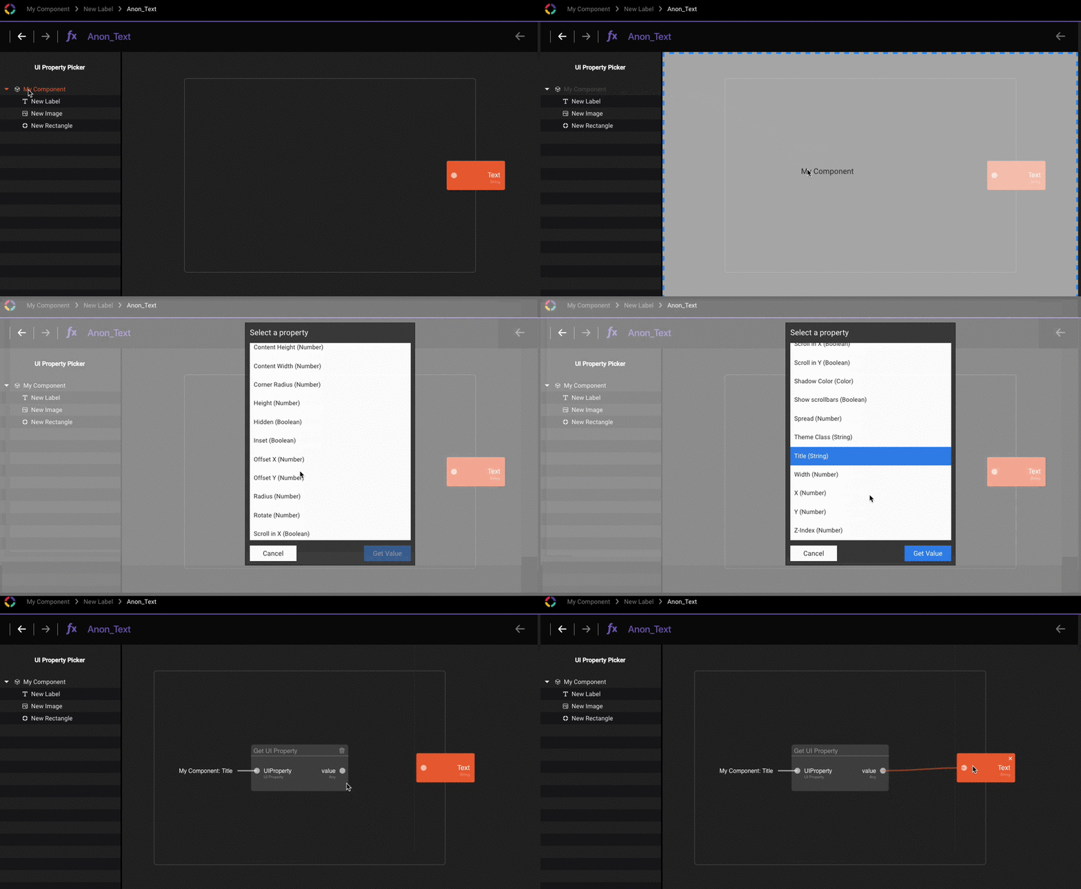
The custom UI Property can then be used in functions inside the Visual Component.
Exercise 4 - Reusable Header
The goal of this exercise is to create a reusable header where the title and the text of a button can be customized.
-
Go back to Project “Notes”
-
Open folder “UI”
-
Add a new Visual Component named “Header” from the Marketplace
-
Open the new Visual Component
-
In Spec & Doc Editor, create 2 String properties: “Title text” and “Left button text”
-
Back to Visual Editor, go to the 3rd tab and set the Background Color property to black
-
Create a label named ”Title” by drag & dropping a "Label" brick from the Marketplace and set:
- 1st tab: Horizontal Align = center; Text color = white
- 2nd tab: X = Center, Y = middle
- In the 1st tab, Text = display Header’s “Title text” property using a function
-
Create a button named “Left button” and set:
- 1st tab: Variant = Outline
- 2nd tab: X = 10, Y = middle
- Text = display Header’s “Left button text” property using a function
-
Go back to Project ”Notes” => “Notes App” and open screen “New note”.
-
Add a new “Header” brick from the Marketplace in the screen and set:
- 1st tab: Title text = “New note”
- 1st tab: Left button text = “Back”
- 2nd tab: X = Center, Y = Top
- 2nd tab: Width = 100%, Height = 90 pixels (selected from the drop-down arrow)