 Olympe SDK
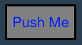 and it will print 'Button pressed!' on the console when pressed.
new Button( [dimension] [, label] [, themeClass])
Creates an instance of Button.
Parameters:
| Name | Type | Argument | Description |
|---|---|---|---|
dimension |
olympe.df.PVector2 |
<optional> |
Width & height for the button. |
label |
olympe.df.POString | string |
<optional> |
Text to display in the button. |
themeClass |
olympe.df.POString | string |
<optional> |
UI Theme class of button. |
- Implements:
Extends
Methods
-
<protected> _appendChild(child, childId, options)
-
Append a child to a layer.
Parameters:
Name Type Argument Description childolympe.df.Proxy.<olympe.ui.std.DockableElement> | olympe.ui.std.DockableElement childIdstring ID of the child (must be unique in this layer)
options* <repeatable>
Can be used if this method is overridden
- Inherited From:
- Overrides:
-
<protected> _removeAllChildren()
-
- Inherited From:
- Overrides:
-
<protected> _removeChild(childId)
-
Remove a child from this layer.
Parameters:
Name Type Description childIdstring ID of the child to remove
- Inherited From:
- Overrides:
-
<abstract> appendChild(child, id, options)
-
Parameters:
Name Type Argument Description childolympe.df.Proxy.<olympe.ui.std.DockableElement> | olympe.ui.std.DockableElement idstring options* <repeatable>
- Inherited From:
- Overrides:
Returns:
- Type
- olympe.ui.std.Layer
-
authorizeOverflow()
-
Authorize the children of this layer to overflow the layer's borders
- Inherited From:
- Overrides:
Returns:
this
- Type
- olympe.ui.std.Layer
-
getFocus()
-
Checks whether this
Elementhas the focus.Warning: Focus may not be applicable on some elements, depending on the platform.
- Inherited From:
- Overrides:
Returns:
trueif Element has focus.- Type
- olympe.df.POBoolean
-
<protected> getGestureEvent()
-
Gets the gesture event manager attached to this element
- Inherited From:
- Overrides:
Returns:
-
getHeight()
-
Gets the height of this element.
- Inherited From:
- Overrides:
- See:
Returns:
the height of this element.
- Type
- olympe.df.PONumber
-
getHTMLElement()
-
Return the DOM HTMLElement if exists (may be null)
- Inherited From:
- Overrides:
Returns:
- Type
- Element
-
<protected> getMouseEvent()
-
Gets the mouse event manager attached to this element.
- Inherited From:
- Overrides:
Returns:
the mouse event manager.
-
getParent()
-
Gets the parent, or container, of this element.
- Inherited From:
- Overrides:
Returns:
the parent of this element.
-
getPosition()
-
Gets the position (x,y) for this element.
- Inherited From:
- Overrides:
Returns:
Position of this element.
- Type
- olympe.df.PVector2
-
getUIProxyDockableElement()
-
Note: needs to be public because it is called by RootElement !
- Inherited From:
- Overrides:
Returns:
The proxy element from the UI thread
- Type
- olympe.uiapi.std.DockableElement
-
<protected> getUIProxyElement()
-
Returns the native UI element associated with this
Element.- Inherited From:
- Overrides:
Returns:
The proxy element from the UI thread.
- Type
- olympe.uiapi.std.Element
-
<protected> getUIProxyLayer()
-
- Inherited From:
- Overrides:
Returns:
Proxified UI object Layer
- Type
- olympe.uiapi.std.Layer
-
getWidth()
-
Gets the width of this element.
- Inherited From:
- Overrides:
- See:
Returns:
the width of this element.
- Type
- olympe.df.PONumber
-
getX()
-
Gets the
xcoordinate of the position of this element.- Inherited From:
- Overrides:
- See:
Returns:
the
xcoordinate for this element.- Type
- olympe.df.PONumber
-
getY()
-
Gets the
ycoordinate of the position of this element.- Inherited From:
- Overrides:
- See:
Returns:
the
ycoordinate for this element.- Type
- olympe.df.PONumber
-
isDisabled()
-
Checks whether this button is disabled or not.
Returns:
- Type
- olympe.df.POBoolean
-
isHidden()
-
Checks whether this
Elementis hidden.- Inherited From:
- Overrides:
Returns:
trueis this element is hidden.- Type
- olympe.df.POBoolean
-
refreshSize()
-
Refresh component internal size
- Inherited From:
- Overrides:
-
<abstract> removeChild(id)
-
Parameters:
Name Type Description idstring - Inherited From:
- Overrides:
Returns:
- Type
- olympe.ui.std.Layer
-
removeTooltip()
-
Removes the tooltip from this element.
- Inherited From:
- Overrides:
Returns:
This element.
-
setAccelerated(accelerated)
-
Sets whether this DockableElement movements should be calculated by the GPU.
Note: This function doesn't guarantee that the implementation will support GPU acceleration.
Parameters:
Name Type Description acceleratedolympe.df.POBoolean | olympe.df.Node | boolean trueif this DockableElement movements should be calculated by the GPU.- Inherited From:
- Overrides:
Returns:
This
DockableElement. -
setAutoHeight(autoHeight [, padding])
-
Enables or disables the automatic height resizing of the button depending on the text of the label.
Parameters:
Name Type Argument Default Description autoHeightolympe.df.POBoolean | olympe.df.Node | boolean trueto enable automatic resizing.paddingolympe.df.PONumber | olympe.df.Node | number <optional>
0 Padding, in pixels, to use to the top and bottom when resizing.
Returns:
this
Button.- Type
- olympe.ui.std.Button
-
setAutoWidth(autoWidth [, sidePadding])
-
Enables or disables the automatic width resizing of the button depending on the text of the label.
Parameters:
Name Type Argument Default Description autoWidtholympe.df.POBoolean | olympe.df.Node | boolean trueto enable automatic resizing.sidePaddingolympe.df.PONumber | olympe.df.Node | number <optional>
0 Padding, in pixels, to use to the left and right when resizing.
Returns:
this
Button.- Type
- olympe.ui.std.Button
-
setBackgroundColor(color)
-
Sets the background color for this
Element.Parameters:
Name Type Description colorolympe.df.Proxy | olympe.df.Node | olympe.df.Color The background color.
- Inherited From:
- Overrides:
Returns:
this
Button.- Type
- olympe.ui.std.Button
-
setBackgroundImage(url [, sizingMode] [, positioningMode] [, size] [, position])
-
Sets the background image for this
Element.Notes:
Parameters:
Name Type Argument Default Description urlolympe.df.POString | olympe.df.Node | string URL for the image.
sizingModeolympe.ui.common.BackgroundImageSize | olympe.df.Proxy | olympe.df.Node <optional>
AUTO The sizing mode for the image.
positioningModeolympe.ui.common.BackgroundImagePosition | olympe.df.Proxy | olympe.df.Node <optional>
TOPLEFT The positioning mode for this image.
sizeolympe.df.Vector2 | olympe.df.Proxy | olympe.df.Node <optional>
Size, in pixel.
positionolympe.df.Vector2 | olympe.df.Proxy | olympe.df.Node <optional>
Position of the image, in pixel. (0,0) if omitted.
- Inherited From:
- Overrides:
Returns:
this
Element. -
setBackgroundImagePosition(position)
-
Sets the background image position for this
Element.Parameters:
Name Type Description positionolympe.df.Vector2 | olympe.df.Proxy | olympe.df.Node The position.
- Inherited From:
- Overrides:
Returns:
this
Element. -
setBackgroundImagePositionMode(positionMode)
-
Sets the position mode for the background image of this
Element.Parameters:
Name Type Description positionModeolympe.ui.common.BackgroundImagePosition | olympe.df.Proxy | olympe.df.Node The positioning mode for this image.
- Inherited From:
- Overrides:
Returns:
this
Element. -
setBackgroundImageSize(size)
-
Sets the background image size for the this
Element.Parameters:
Name Type Description sizeolympe.df.Vector2 | olympe.df.Proxy | olympe.df.Node The image size, in pixels.
- Inherited From:
- Overrides:
Returns:
this
Element. -
setBackgroundImageSizeMode(sizeMode)
-
Sets the sizing mode for the background image of this
Element.Parameters:
Name Type Description sizeModeolympe.ui.common.BackgroundImageSize | olympe.df.Proxy | olympe.df.Node The sizing mode.
- Inherited From:
- Overrides:
Returns:
this
Element. -
setBackgroundImageSrc(src)
-
Sets the URL (or source) for the background image.
Parameters:
Name Type Description srcolympe.df.POString | olympe.df.Node | string URL for the image.
- Inherited From:
- Overrides:
Returns:
this
Element. -
setBlur()
-
Removes focus from this Element.
Warnings:
- Focus may not be applicable on some elements, depending on the platform.
- Elements not inside a container (screen, etc.) can't get the focus.
- Inherited From:
- Overrides:
Returns:
this
Element. -
setBorder(width, color)
-
Sets the border width & color for this element. a width of
0means no visible border.Parameters:
Name Type Description widtholympe.df.ONumber | number | olympe.df.Node | olympe.df.Proxy the width, in pixels, for the border
colorolympe.df.Color | olympe.df.Node | olympe.df.Proxy the color for the border
- Inherited From:
- Overrides:
Returns:
this
Button.- Type
- olympe.ui.std.Button
-
setBorderColor(color)
-
Set the border color on this element.
Parameters:
Name Type Description colorolympe.df.Color | olympe.df.Proxy.<olympe.df.Color> - Inherited From:
- Overrides:
Returns:
-
setBorderWidth(width)
-
Set the border width on this element. a width of
0means no visible border.Parameters:
Name Type Description widthnumber | olympe.df.PONumber - Inherited From:
- Overrides:
Returns:
-
setContextMenuEnabled(enabled)
-
Enable/disable context menu on this element.
Parameters:
Name Type Description enabledboolean trueto enable the context menu,falseto disable it.- Inherited From:
- Overrides:
Returns:
this
Element. -
setCornerRadius(radius)
-
Sets the rounded corner radius (in pixels) for this element.
Parameters:
Name Type Description radiusolympe.df.PONumber | olympe.df.Node | number Radius in pixels.
- Inherited From:
- Overrides:
Returns:
this
DockableElement. -
setDefaultTextColor(color)
-
Sets the label text color to use for this button when it is in
default(enabled, not pressed) state.Parameters:
Name Type Description colorolympe.df.PColor | olympe.df.Node The text color.
Returns:
this
Button.- Type
- olympe.ui.std.Button
-
setDimension(dimension)
-
Sets the dimension (width, height) for this element.
Parameters:
Name Type Description dimensionolympe.df.Vector2 | olympe.df.Proxy | olympe.df.Node Dimension of this element.
- Inherited From:
- Overrides:
Returns:
- Type
- olympe.ui.std.Button
-
setDisabled(disabled)
-
Enables or enables this button. A disabled button can not be interacted with but is still visible.
Parameters:
Name Type Description disabledolympe.df.POBoolean | olympe.df.Node | boolean trueto disable this button,falseto enable itReturns:
this
Button- Type
- olympe.ui.std.Button
-
setDisabledBackgroundColor(color)
-
Sets the background color to use for this button when it is in
disabledstate.Parameters:
Name Type Description colorolympe.df.PColor | olympe.df.Node The background color.
Returns:
this
Button.- Type
- olympe.ui.std.Button
-
setDisabledBorderColor(color)
-
Sets the border color to use for this button when it is in
disabledstate.Parameters:
Name Type Description colorolympe.df.PColor | olympe.df.Node The border color.
Returns:
this
Button.- Type
- olympe.ui.std.Button
-
setDisabledBorderWidth(width)
-
Sets the border width to use for this button when it is in
disabledstate.Parameters:
Name Type Description widtholympe.df.PONumber | olympe.df.Node | number The border width.
Returns:
this
Button.- Type
- olympe.ui.std.Button
-
setDisabledTextColor(color)
-
Sets the label text color to use for this button when it is in
disabledstate.Parameters:
Name Type Description colorolympe.df.PColor | olympe.df.Node The text color.
Returns:
this
Button.- Type
- olympe.ui.std.Button
-
setFocus()
-
Gives the focus to this Element.
Warnings:
- Focus may not be applicable on some elements, depending on the platform.
- Elements not inside a container (screen, etc.) can't get the focus.
- Inherited From:
- Overrides:
Returns:
this
Element. -
setFontColor(color)
-
Sets the label text color to use for this button when it is in
default(enabled, not pressed) state.Parameters:
Name Type Description colorolympe.df.PColor | olympe.df.Node The text color.
- Deprecated:
-
- use
setDefaultTextColorinstead.
- use
Returns:
this
Button.- Type
- olympe.ui.std.Button
-
setFontFamily(fontFamily)
-
Sets the label font family for the bake of this
Button.Parameters:
Name Type Description fontFamilyolympe.df.POString | string | olympe.df.Node the font family.
Returns:
this
Button.- Type
- olympe.ui.std.Button
-
setFontSize(fontSize)
-
Sets the label font size for the text of this
Button.Parameters:
Name Type Description fontSizeolympe.df.PONumber | number | olympe.df.Node The font size, in pixels.
Returns:
this
Button.- Type
- olympe.ui.std.Button
-
setFontStyle(fontStyle)
-
Sets the label font style (normal, italic, ...) for the text of this
Button.Parameters:
Name Type Description fontStyleolympe.ui.common.FontStyle | olympe.df.Proxy | olympe.df.Node The style.
Returns:
this
Button.- Type
- olympe.ui.std.Button
-
setFontWeight(fontWeight)
-
Sets the label font weight for the label of this
Button.Parameters:
Name Type Description fontWeightolympe.df.PONumber | number | olympe.df.Node The font weight.
Returns:
this
Button.- Type
- olympe.ui.std.Button
-
setHidden(hidden)
-
Sets whether this
Elementis hidden or not. A hidden element will not appear on the screen.Parameters:
Name Type Description hiddenolympe.df.POBoolean | boolean | olympe.df.Node trueif content must be hidden,falseotherwise.- Inherited From:
- Overrides:
Returns:
this
Element. -
setHoverBackgroundColor(color)
-
Sets the background color to use for this button when it is in
hoverstate.Parameters:
Name Type Description colorolympe.df.PColor | olympe.df.Node The background color.
Returns:
this
Button.- Type
- olympe.ui.std.Button
-
setHoveredBorderColor(color)
-
Sets the border color to use for this button when it is in
hoveredstate.Parameters:
Name Type Description colorolympe.df.PColor | olympe.df.Node The border color.
Returns:
this
Button.- Type
- olympe.ui.std.Button
-
setHoveredBorderWidth(width)
-
Sets the border width to use for this button when it is in
hoveredstate.Parameters:
Name Type Description widtholympe.df.PONumber | olympe.df.Node | number The border width.
Returns:
this
Button.- Type
- olympe.ui.std.Button
-
setIcon(code)
-
Sets the icon to display after the label of this
Button.Parameters:
Name Type Description codeolympe.df.POString | string | olympe.df.Node The icon.
Returns:
this
Button.- Type
- olympe.ui.std.Button
-
setIconPadding( [padding])
-
Enables or disables the automatic height resizing of the button depending on the text of the label.
Parameters:
Name Type Argument Default Description paddingolympe.df.PONumber | olympe.df.Node | number <optional>
0 Padding, in pixels, to use to the top and bottom when resizing.
Returns:
this
Button.- Type
- olympe.ui.std.Button
-
setIgnoreUserInteraction( [ignore])
-
Disables mouse events for this element. However, mouse events will target its descendants unless they are manually set to also ignore user interactions.
Parameters:
Name Type Argument Default Description ignoreboolean | olympe.df.POBoolean <optional>
false ignore
trueto make this element ignore mouse events and pass them to its children.- Inherited From:
- Overrides:
Returns:
this
Element. -
setLabel(label)
-
Parameters:
Name Type Description labelolympe.df.OString | string | olympe.df.Node | olympe.df.Proxy - Deprecated:
-
- Should use setText function instead (for consistency and to cope with interface olympe.ui.std.DockableElementWithText)
Returns:
this
Button- Type
- olympe.ui.std.Button
-
setOpacity(opacity)
-
Sets the opacity, or alpha channel, for this
Element. This is a float value between 0 and 1. 0 being transparent and 1 being opaque.Parameters:
Name Type Description opacityolympe.df.ONumber | number | olympe.df.Proxy | olympe.df.Node the opacity (between 0 and 1).
- Inherited From:
- Overrides:
Returns:
this
Element. -
setParent(parent)
-
Sets the parent of this element.
Important: This method must be called when this element is added to a container or layout.
Parameters:
Name Type Description parentolympe.df.Proxy.<olympe.ui.std.Element> | olympe.ui.std.Element The parent for this element.
- Inherited From:
- Overrides:
Returns:
This
DockableElement. -
setPosition(position)
-
Sets the position (x,y) for this Element.
Parameters:
Name Type Description positionolympe.df.Vector2 | olympe.df.Proxy | olympe.df.Node The position of this element.
- Inherited From:
- Overrides:
Returns:
this
DockableElement. -
setPressedBackgroundColor(color)
-
Sets the background color to use for this button when it is in
pressedstate.Parameters:
Name Type Description colorolympe.df.PColor | olympe.df.Node The background color.
Returns:
this
Button.- Type
- olympe.ui.std.Button
-
setPressedBorderColor(color)
-
Sets the border color to use for this button when it is in
pressedstate.Parameters:
Name Type Description colorolympe.df.PColor | olympe.df.Node The border color.
Returns:
this
Button.- Type
- olympe.ui.std.Button
-
setPressedBorderWidth(width)
-
Sets the border width to use for this button when it is in
pressedstate.Parameters:
Name Type Description widtholympe.df.PONumber | olympe.df.Node | number The border width.
Returns:
this
Button.- Type
- olympe.ui.std.Button
-
setPressedTextColor(color)
-
Sets the label text color to use for this button when it is in
pressedstate.Parameters:
Name Type Description colorolympe.df.PColor | olympe.df.Node The text color.
Returns:
this
Button.- Type
- olympe.ui.std.Button
-
setRotationAngle(angle)
-
Sets the rotation angle (in degree) for this element.
Parameters:
Name Type Description angleolympe.df.ONumber | number | olympe.df.Node | olympe.df.Proxy the angle, in degree.
- Inherited From:
- Overrides:
Returns:
This
DockableElement. -
setScale(scale)
-
Sets the scaling factor for the width and height of this element.
Parameters:
Name Type Description scaleolympe.df.PVector2 | olympe.df.Node scaling vector (w, h).
- Inherited From:
- Overrides:
Returns:
This
DockableElement. -
setShadow( [offset] [, radius] [, spread] [, color] [, inset])
-
Set shadow on this DockableElement. A shadow is defined by its offset, the blur radius, the spread radius (all in pixels) and a base color. A shadow is by default 'external
, but can be made internal by setting the 'inset' parameter totrue`.Parameters:
Name Type Argument Default Description offsetolympe.df.Vector2 | olympe.df.Node | olympe.df.Proxy.<olympe.df.Vector2> <optional>
0 Offset in pixels.
radiusolympe.df.PONumber | olympe.df.Node | number <optional>
0 Blur radius in pixels.
spreadolympe.df.PONumber | olympe.df.Node | number <optional>
0 Spread in pixels.
colorolympe.df.Color | olympe.df.Node | olympe.df.Proxy.<olympe.df.Color> <optional>
'#000000' Shadow color.
insetolympe.df.POBoolean | olympe.df.Node | boolean <optional>
false trueif the shadow is inset.- Inherited From:
- Overrides:
Returns:
This
DockableElement. -
setShadowPSStyle(color, angle, distance, spread, size, inset)
-
Set shadow on this DockableElement as done in Photoshop.
Parameters:
Name Type Description colorolympe.df.Color | olympe.df.Node | olympe.df.Proxy.<olympe.df.Color> Shadow Color.
angleolympe.df.PONumber | olympe.df.Node | number Angle, in radians.
distanceolympe.df.PONumber | olympe.df.Node | number Distance, in pixels.
spreadolympe.df.PONumber | olympe.df.Node | number Spread in pixels.
sizeolympe.df.PONumber | olympe.df.Node | number Size, in pixels.
insetolympe.df.POBoolean | olympe.df.Node | boolean trueif the shadow is inset.- Inherited From:
- Overrides:
Returns:
This
DockableElement. -
setStyle(style, value)
-
Parameters:
Name Type Description stylestring CSS style name
valuestring | number CSS style value
- Inherited From:
- Overrides:
Returns:
this
Element. -
setTabIndex(tabIndex)
-
Sets the tab index to this
Element. Tab Index defines the tabulation or 'next' order while going through a form.Parameters:
Name Type Description tabIndexolympe.df.PONumber | olympe.df.ONumber | number | olympe.df.Node The tab index.
- Inherited From:
- Overrides:
Returns:
this
Element. -
setText(label)
-
Sets the text to display as the label of this
Button.Parameters:
Name Type Description labelolympe.df.POString | string | olympe.df.Node The text.
- Implements:
Returns:
this
Button.- Type
- olympe.ui.std.Button
-
setTextColor(textColor)
-
Set the default color for the label of this
Button.Parameters:
Name Type Description textColorolympe.df.PColor | olympe.df.Node The color.
- Implements:
- See:
Returns:
this
Button.- Type
- olympe.ui.std.Button
-
setTextHorizontalAlign(textAlign)
-
Sets the horizontal alignment for the label of this button.
Parameters:
Name Type Description textAlignolympe.ui.common.HorizontalAlign | olympe.df.Proxy | olympe.df.Node The horizontal alignment.
Returns:
this
Button.- Type
- olympe.ui.std.Button
-
setTextOverflow(overflowStyle)
-
Sets the text overflow to the label of this
Button. overflow styles are defined in olympe.ui.common.TextOverflow:- ELLIPSIS
- CLIP
- FADE with the default text overflow behaviour being "CLIP". N.B.: as of now, wrapping whitespaces will override the text overflow property (i.e. text clipped if too long)
Parameters:
Name Type Description overflowStyleolympe.ui.common.TextOverflow | string | olympe.df.Node Defaults to 'clip'
Returns:
this
Button.- Type
- olympe.ui.std.Button
-
setTextVerticalAlign(textAlign)
-
Sets the horizontal alignment for the label of this button.
Parameters:
Name Type Description textAlignolympe.ui.common.VerticalAlign | olympe.df.Proxy | olympe.df.Node The vertical alignment.
Returns:
this
Button.- Type
- olympe.ui.std.Button
-
setThemeClass(themeClass)
-
Method to override if this dockable element supports themes.
Parameters:
Name Type Description themeClassolympe.df.POString | olympe.df.Node | string The theme class.
- Inherited From:
- Overrides:
Returns:
- Type
- olympe.ui.std.Button
-
setTooltip(text [, options])
-
Assigns a tooltip to that element that will show up when the mouse hovers over it.
Parameters:
Name Type Argument Description textolympe.df.POString The text of the tooltip.
optionsObject <optional>
Various options for displaying the tooltip.
Properties
Name Type Argument Description positionolympe.df.PVector2 <optional>
The absolute position of the tooltip.
backgroundolympe.df.PColor <optional>
The background color.
foregroundolympe.df.PColor <optional>
The text color.
fontSizeolympe.df.PONumber <optional>
The font size.
borderSizeolympe.df.PONumber <optional>
The size of the border. Default is 1.
borderColorolympe.df.PColor <optional>
The color of the border. Default is black.
delayolympe.df.ONumber | number <optional>
The delay, in milliseconds, before showing the tooltip. Default is 500.
startingPosolympe.df.Vector2 <optional>
The starting position of the mouse. Default is (0,0).
themeolympe.df.POString <optional>
The theme class to apply to this tooltip.
- Inherited From:
- Overrides:
Returns:
This Element.
-
setUniformScale(scale)
-
Sets the scaling factor for this element.
Parameters:
Name Type Description scaleolympe.df.PONumber | olympe.df.Node | number The scaling factor.
- Inherited From:
- Overrides:
Returns:
This
DockableElement. -
setWrapWhiteSpaces(doWrap)
-
Sets the text "wrap whitespaces" property, its default being "false". N.B.: as of now, wrapping whitespaces will override the text overflow property (i.e. text clipped if too long)
Parameters:
Name Type Description doWrapolympe.df.POBoolean | boolean | olympe.df.Node Returns:
this
Button.- Type
- olympe.ui.std.Button
-
setZIndex(zIndex)
-
Sets the z-index for this element. This determines how elements are layered when they overlap on the screen. Higher Z-index elements are placed on top of lower Z-index elements.
Parameters:
Name Type Description zIndexolympe.df.PONumber | olympe.df.Node | number Index of element on z axis.
- Inherited From:
- Overrides:
Returns:
This
DockableElement.