Introduction
Welcome back Olympian ☀️
In the last chapter we created our first UI application and added a bit of Logic in it.
In this chapter we will see how to solve a very common problematic in UI development. Along this we will discover the Image component, create a new app with composition and speak about scopes and other things 😃
A New App: Slide Show
Did you one day dream of sharing your pictures with your family and friends, on an online website?
If yes, that's great! As we will create a Slide Show application during this chapter.
If not, well we will do it anyway, this small project is for learning new concepts in the end 😉
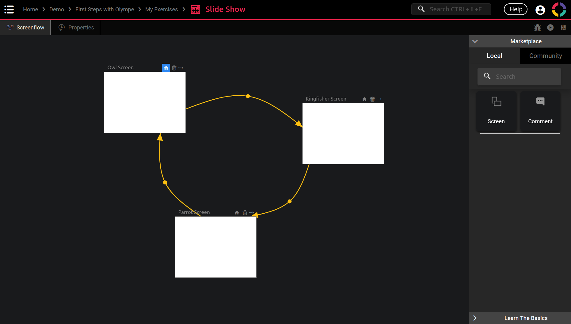
So first let's setup a new UI App called Slide Show (where you want, I use my My Exercises folder personnally). In it you can create 3 screens (Owl Screen, Kingfisher Screen and Parrot Screen) and connect them like this:
Let's enter the Owl Screen: now how to show an image or a picture in DRAW?
You can try to find it in the Marketplace 😉
You may have guessed it but yes, DRAW provide a Visual Component to do just that: the Image component!
But to show a picture we need one. Here you can just copy this link (it is an owl picture):
https://cdn.pixabay.com/photo/2012/06/19/10/32/owl-50267_960_720.jpg
With this link copied, we can create our first even Image in DRAW:

Easy right 😉
You can play around with the other properties, but the default values are usually fine.
Still you may wonder why there is an Image property and an Image URL one. That's because we have two way of using pictures in DRAW:
- With
Image URL, this is when the picture is hosted on another server and you can show it with an URL. - With
Image, this is when the picture is stored in DRAW directly! To achieve that you can check the Media Library brick in the Marketplace when you are in the Project Editor 😉
For our Slide Show app the Image URL property will be enough.
I already searched for some birds 🐦 pictures online, you can save those URLs:
- Owl: https://cdn.pixabay.com/photo/2012/06/19/10/32/owl-50267_960_720.jpg
- Kingfisher: https://cdn.pixabay.com/photo/2017/02/07/16/47/kingfisher-2046453_960_720.jpg
- Parrot: https://cdn.pixabay.com/photo/2018/08/12/16/59/parrot-3601194_960_720.jpg
Until now there is still no sight of any problem. Bear with me, we are almost there!
The Problem: Time is Limited
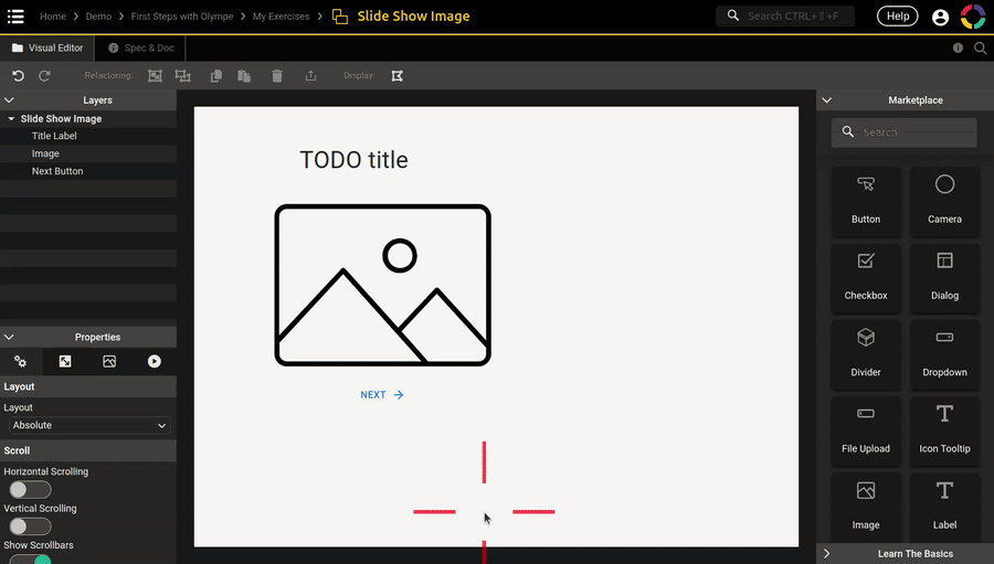
For our Slide Show the Image alone is not enough, we need a Button to switch from one screen to the next one. And for good measure we can also add a Label as a title for each picture.
Okay so let's continue with the Owl Screen, we already did:
- Add the Image component from the Marketplace
- Eventually renamed it in the Layers panel.
- Set its
Image URLproperty.
Now what is left to do:
- Position and size the Image nicely, so 4 properties:
X,Y,Width,Height - Add the Label and set its properties:
Text,Text Variant,Text Color,Horizontal Align,X,Y,Width,Height - Add the Button and set its properties:
Text,Variant,End Icon,X,Y,Width,Height
That was some steps, but with a bit of practice it's actually not that long.
Cool so let's continue with the Kingfisher Screen now, we do:
- Add the Image 😃 and set its properties:
Image URL,X,Y,Width,Height - Add the Label 😓 and set its properties:
Text,Text Variant,Text Color, ... - Add the Button 😴 and ...
See where I am going with this?
We are doing the exact same steps over and over again!
And this is problematic in many ways:
- It takes a lot of time, we all now that time is precious, and we only did it for 3 pictures!
- It is not fun, and developing should be fun and not bothersome.
- It is not maintainable. Imagine after doing 7 screens that you want to change the Label color? You will need to do it manually 7 times!
- Developers are by essence lazy, they take time to create application to gain time later on 😃
Hopefully for us, this is a very common issue in all programming languages and there are multiple solutions to it.
DRAW is not different and we will see how to handle that 💪
The Solution: Composition
So how can we solve this issue?
As for all problem, let's start by assessing what we have (or may have):
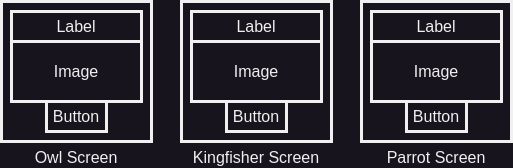
We have 3 screens, and each of them contains exactly the same components: a Label, an Image and a Button.
Would it not be nice to regroup those 3 components? And use only 1 component in the screens?
I cannot create any suspense here :satisfied:
Yes! This is the solution and it is called Composition.

We will create a brand new Visual Component that contains our 3 components, and then the screens will directly use this new Visual Component that we created 😉
- We will significantly reduce the number of steps required.
- Also if we want to change the title color for example, only 1 step is required.
What is this word Composition exactly? Let me try to explain it:
See how the Visual Component contains 3 components? Another phrasing would be: the Visual Component is composed of 3 components 😉 In this same logic, our screens are each composed of 1 component: our brand new Visual Component. Another example: our UI App is composed of one Screenflow, which itself is composed of 3 screens!
For a more advanced explanation, check the Wikipedia page: https://en.wikipedia.org/wiki/Object_composition
Fun fact: another ancient name of DRAW was the Composer.
Okay enough talking, let's see how to do that with Olympe!
Our First Visual Component
Until now we only used Visual Component that already existed: Label, Button, TextField and Image.
Those components are common to most application, that's why there are provided by default. But as you can imagine now, we can also create our own Visual Component that do what we want it to do.
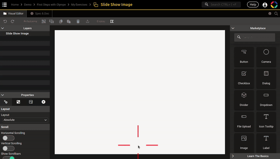
Check this gif and create your first Visual Component, call it Slide Show Image:
Enter it and here we are, the Visual Component Editor!
It looks a lot like the Screen Editor isn't it? Yes it does, we will speak a little bit more about that later in this chapter. For now all you need to remember: both editors work exactly the same! So everything we learnt in the last chapter is true here 😉
That also means that it has a Spec&Doc Tab to edit the properties, events and documentation.
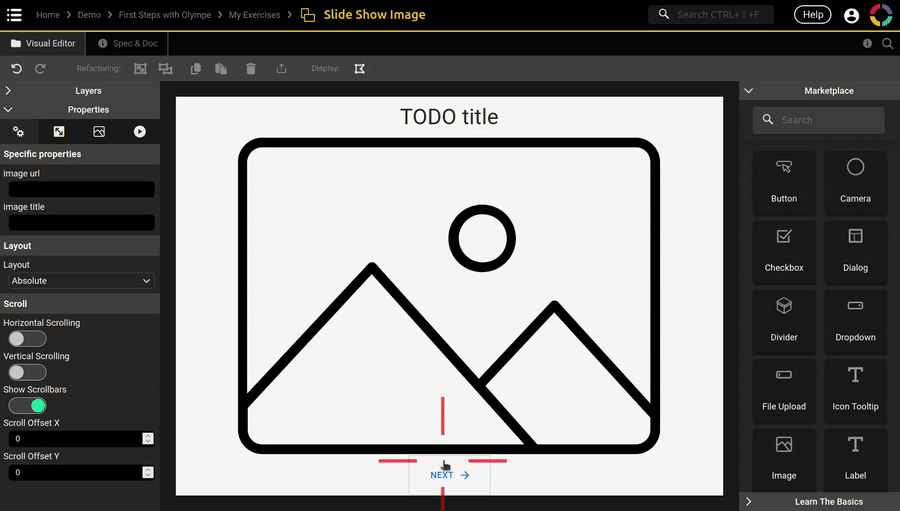
Go in it and create those properties and events, we will need them:

Now go ahead and add the components, follow this gif for guidance:
Cool! Let's set the position and size now. Instead of setting them with constant numbers as we did before. Let's use the special functions provided. Check this gif to understand what to do, you can also play with it:
That's nice isn't it 😉
Those special functions are quite explicite in what they do, but I felt like a little explanation would still be useful:
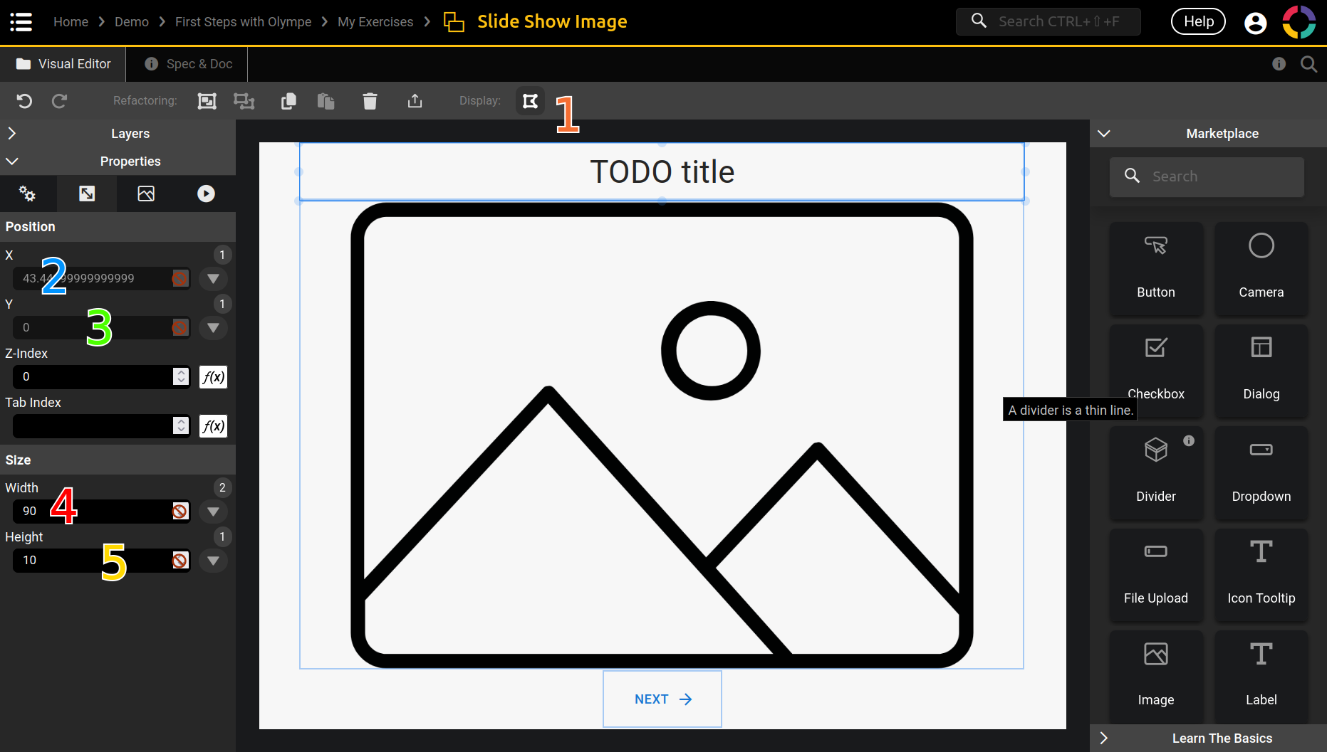
- Notice the little button right to Display. This is the Wireframe view, basically it shows the borders of each components. This can be very useful when placing them or also when you have an invisible component.
- The
Xproperty that you already know, I use here theCenterspecial function which centers the component horizontally.- (I have the Label selected)
- The
Yproperty that you also already know, I use here theTopspecial function which put the component at the top vertically. I could use the constant value zero in this case, the result would be the same. - The
Widthproperty with the special function Percentage. A value of90means that the component will be 90% of the Slide Show Image width. If the Slide Show Image is 100px wide, then the value is 90px. If it is 200px wide, then the value is 180px. And so on. - Same as for
Widthbut for theHeightthis time, 10%.
Let's Bind with the Prop Picker
We have our components in place, but how can we show a different title and image in each screen? For that we will make some properties dynamic by adding logic to them. And their values will be configured in the screens directly.
How can we do that? With the Prop Picker! And by doing what is called: Binding
Binding is about linking the value of a property of a component, to another property of another component:
- We want to bind the
Textproperty of the Title Label to be the value of the propertyimage titleof our component Slide Show Image (remember: we already created it). - We want to bind the
Image URLproperty of the Image to be the value of the propertyimage urlof our component Slide Show Image. - We want to bind the
On Clickevent of the Next Button to dispatch theon next clickedevent of our component Slide Show Image.
So let's do just that, in this gif we bind the Image and the Button:

Go ahead and try to do it for the Label too before checking the gif:
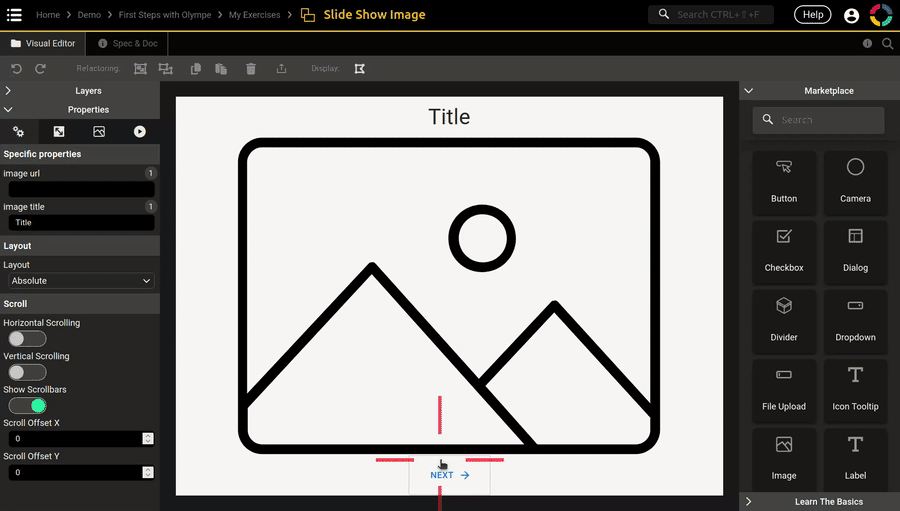
After binding the label, you will not see it anymore! That's normal, the image title being empty, the Text property is then also emtpy. To solve that an easy way is to use a default value for the property image title. The gif shows how to do just that 😉
To do all those bindings we used the Prop Picker, let's have one more look at it:

- The Prop Picker is about accessing a property or an event on a specific component. What you can access is the parent (in our case the Slide Show Image) and the children (the 3 components), this is what we call a scope and I will speak about it in a short time.
- The properties are listed here, with the name and the type between parenthesis.
- You can filter the properties by typing the part of the name here, like the search bar in the Marketplace.
- After selecting the property, you have the choice for three actions:
- Get Value will create the brick Get UI Property, it is for getting the value of the property.
- Set Value will create the brick Set UI Property, it is for setting the value of the property.
- Feed Value_ will create the brick Feed UI Property, it is for setting the value of the property continuously. This is a very specific one and we don't need to understand it for now.
It works almost the same for events, only the actions changes: dispatch and listen.

- We already used the brick Dispatch Event (created with Dispatch button), it triggers an event. It is for starting the event: like hey! this happened or hey! do this.
- Listening to an event is the exact contrary, it is was to do after the event was triggered. When we add logic on the
On Clickevent of the Button, that's exactly what we do.
Okay our Slide Show Image component is now ready for usage in our screens 🎉
But before that I want to talk a bit about scopes.
A Little Peak onto Scopes
The concept of scopes is a little bit more advanced, but hopefully at the end you can grasp at least something from it. Especially understanding a bit more why bindings are important and also what are the purpose of it. It should also make the purpose of the Prop Picker more obvious.
Let's start with a first schema:

Here we are representing the scope of the Screenflow. The yellow arrows shows who can bind with who, let's get into some therminology here:
- The Screenflow is the parent, and it can interacts with its children.
- Each screen is a child, and they can interacts with the parent and their siblings (the other children).
However the parent cannot interacts with its grand-children (what is inside the screens).
Also a child cannot interact with the children of a sibling (also what is inside).
Let's do the same schema but for the Slide Show Image component we created:

See how similar it is? The therminology is exactly the same, as for who can interact (bind) with who 😉
The bindings we did in the last chapter are here:
- We could only use the Prop Picker on those 4 components (1 parent and 3 children).
- The
Textproperty of the Title Label is bound with theimage titleproperty of its parent.
And this is exactly what a scope is. It is who (or what) a specific component can bind with 😉
Let's continue the exercise a bit further with the scope of a single screen, Owl Screen:

We did not do it yet, but the screen will be composed of a Slide Show Image component.
And this is where we will configure the component differently in each screen! The Owl Screen does not have access to its grand-children to change the Title Label directly, but it can set the image title of the Slide Show Image, and this value will then propagate down.
To go a little deeper let's combine all the schemas together:

Here I changed the arrows colors to really show who can interact with who 😉
In this schema we can see some kind of frontiers:
- Between the blue arrows that are inside the Slide Show Image and the red arrows that are outside.
- Between the red arrows that are inside the Owl Screen and the yellow arrows that are outside.
Let's zoom in at one of those frontier to see what live there:

Properties and Events! This is what make the bridge from the inside to the outside, and vice-versa 😃
And we can see the actions that the Prop Picker allows us to do with them!
From an inside point of view:
- We can get the value of a property that was set from the outside.
- We can set the value of a property that the outside can then get.
- We can dispatch an event, and the outside can listen to it.
- We can listen to an event, the outside can also dispatch it for the inside to know.
From an outside point of view it is the same, but in reverse.
And that wraps up this section about scopes. Do not worry if it is not all clear yet.
In the end it is just a story of who can speak with who, and how properties and events are the messagers 😉
Pictures Slideshow
We are almost done with our little Slide Show app, let's put the Slide Show Image to work!
First the Owl Screen, the component we created can now be found in the Marketplace directly 😉
Here is a gif of the process:
It is the same for the Kingfisher Screen, try it by yourself! Here the gif for reference:

And last but not least, the Parrot Screen:

Do you feel how fast it was to setup those 3 screens?
Indeed we took some time to create the Slide Show Image component, but after that the screens are a breeze.
And that is the power of composition 💪
Before we can test our application, we need to setup the transitions in the Screenflow. In the previous chapter we create a new event on the screen, then dispatched it in the button On Click. This is very common to do and also quite cumbersome. Luckily the Screenflow Editor has our back and there is a quicker way to do it.
Check this out:
And same for the two remaining transitions:
Yay 🎉 Go ahead and test the app!
The Title Color is Bad
Remember what we talked about: how composition would help us change the title color in only one step?
You can try to do it 😉 Here is the gif that demonstrate just that:

By double-clicking on the Slide Show Image in the Owl Screen, it directly jumps inside the component editor 😉
Screen vs Visual Component
We noticed that the Screen Editor looks and works the same as the Visual Component Editor. So why do we need both? And what are the differences between them? I promised you to speak about that, so here we are.
The short answer is that both editors are exactly the same because a Screen is a Visual Component. And there is actually no Screen Editor, we use the Visual Component Editor in both cases.
The contrary however is not true: not all Visual Component are Screens.
We need Screen for one reason: to use it in the Screenflow 😉
But other than that, a Screen is exactly like the Slide Show Image or a Label. However it can not be used in a place other than the Screenflow.
Here is a little table to resume it:
| Screen | Visual Component | |
|---|---|---|
| Is a Visual Component? | Yes | Yes |
| Has properties? | Yes | Yes |
| Has events? | Yes | Yes |
| Can be used in Visual Component? | No | Yes |
| Can be used in Screen? | No | Yes |
| Can be used in Screenflow? | Yes | No |
Conclusion
That's it for this chapter, congrats!
With the last chapter and this one about UI and Composition, you can already do some quite fancy applications 😉
This may sound overwhelming but trust me, at this point you probably just miss practice 💪
Of course there are still some important concepts to learn before being an Olympe god!
In the next chapter we will go back into the Logic world, and speak about interactions with Action.
Project Practice
It's project time! 🎉
Without further do, let's put into practice what we learnt in this chapter.
Go to your Guess the Number project and create a new folder called UI, in it you can create a new Visual Component called Content Component.
This is the component you need to create:

Try to reproduce as much a possible by yourself, below are all the properties and values I used.
There are some special things we didn't use yet:
- Content Component:
- In the 3rd tab:
Allow Content Overflowshould be set toTrue - Add property
descriptionof type Text, default value is"_description_" - Add property
actionof type String, default value is"<action>" - Add event
on action clicked
- In the 3rd tab:
- BG Rectangle of type Rectangle:
X, Y, Width and Height:Center, Middle, 100%, 100%Color(in the 3rd tab):#FFFFFF(white)Border Radius:12CSS Property:"box-shadow: 6;"
- Title Label of type Label:
Text:"**Guess the Number!**"Text Variant:Heading 2With Format:True(activated / enabled)- Read the Label documentation to understand what is happening with this property 😉
Text Color:#06A898(green, choose what you like)Horizontal Align:CenterX, Y, Width and Height:Center, 37, 90%, 72
- Description Label of type Label:
Text: bind it withdescriptionWith Format:TrueText Color: same as the Title LabelHorizontal Align:CenterX, Y, Width and Height:Center, 140, 90%, 200
- Action Button of type Button:
Text: bind it withactionMUI sx [json]:"{"fontSize":"32px"}"Y, Width and Height:370, 210, 70X: bind a dynamic value- The formula is:
X = (Description Label).X + (Description Label).Width - (Action Button).Width (Description Label).Xmeans the propertyXof the component Description Label- Hint: This is the perfect time to use the Prop Picker more extensively (3 times!)
- Hint: You will need the brick Plus and the brick Minus
- The formula is:
Color(in the 3rd tab): same as the Title LabelOn Click: dispatch the eventon action clicked
Add the Component in Screens
Now let's add it in the four screens, do that and set the X, Y, Width and Height as follow: Center, 50, 650, 470
Now the action property:
| Home Screen | Play Screen | Win Screen_ | Loose Screen | |
|---|---|---|---|---|
action | "Play!" | "Guess" | "New Game" | "Try Again" |
In the on action clicked event you can just dispatch the event of your choice to go to the next screen.
We will add what is missing in the next chapter 😉
To finish this practice, let do the description property.
Description: Home Screen
In the Home Screen the value is:
The objective of this game is to guess the _Mystery Number_!
- The number is between 1 and 100 (inclusive)
- You have max 10 attempts to guess it

Click on the **Play!** button to start:
Yes it is a multiline string. We can do that because we chose Text instead of String for the description type. Notice also the markdown usage, read the Label documentation if you don't know what I'm talking about.
Description: Play Screen
Now in the Play Screen we will use a dynamic value:

The first input value is this one:
Enter a number between 1 and 100 and click the **Guess** button.

You have **$1** attempts left.

**$2**
The Format String brick is a bit like the Concat brick, but much more powerful to use.
Check out its documentation!
Let's stay in the Play Screen, we need another component for the player to enter its guess:
- Guess TF of type TextField:
Type:Number,Color:Success,Auto Focus:TrueX, Y, Width and Height:Center, 420, 125, 70
Description: Win Screen
Now in the Win Screen we will also use a dynamic value:
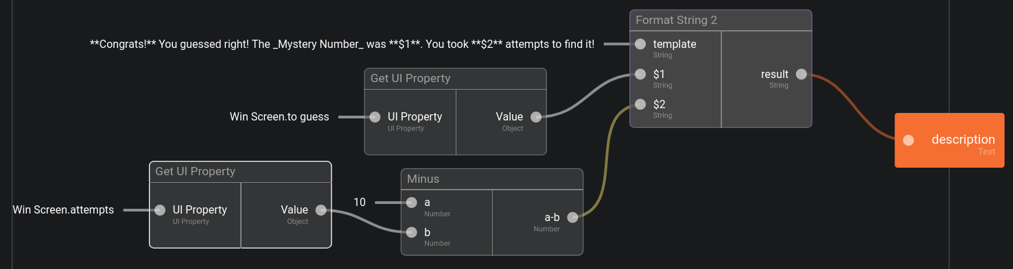
The first input value is this one:
**Congrats!** You guessed right!

The Mystery Number was **$1**.
You took **$2** attempts to find it!
Description: Loose Screen
Let's finish with the Loose Screen and also a dynamic value:

The first input value is this one:
Oh no, you didn't find the _Mystery Number_ in 10 attempts.

The number was **$1**!

Don't worry, you can try again ;-)
Practice Conclusion
This practice section was a bit more directed than the previous ones. Since it's mainly UI there is not much thing going on! However my design is purely personal, don't hesitate to play around and create your own design 😉 As long as you keep the properties and events, the UI itself is secondary.
This is the running app, I just do a loop Home>Play>Win in my on action clicked:

The game is starting to take shape 😃
All that missing is the actual logic of the game, and we will add it right in the next chapter!