Expense App Tutorial
This tutorial goes straight to the point. If you want to get more context around what you are doing, take a look at our Guided Overview, or go through the various sections on DRAW Data, Logic, UI, etc.
The goal of this tutorial is to create multi-screen app with Olympe DRAW. It consists in a basic Expense App where a user can create new expenses with basic details, take a picture of the receipt and then consult the expenses created. You can find the final result in the Examples / Expense project.
We will build the app as follows:
- We start by creating the data model to store our expenses.
- We then add some logic bricks to make it easy to manipulate our expenses.
- We then move to the UI and build the various screens.
1. Project
Let's start by creating a project that will contain our Expense App.
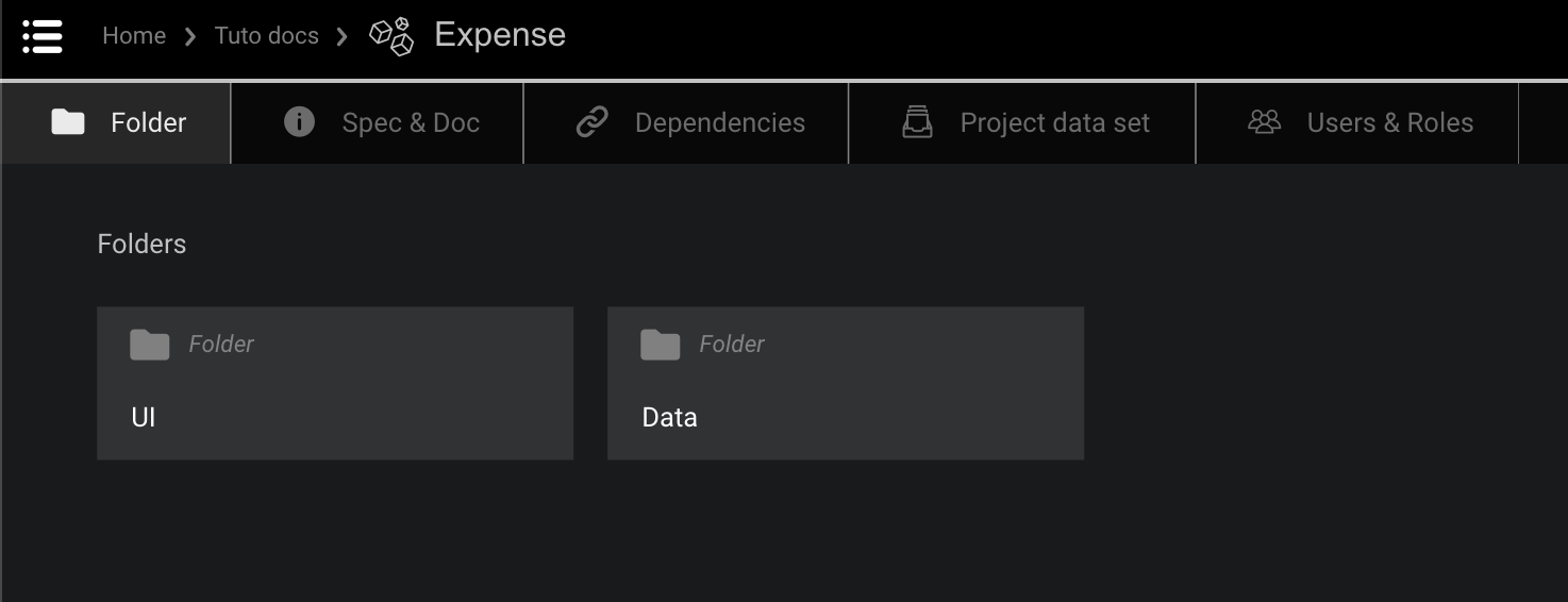
- Create a Project, name it
Expenseand open it.- Create the following Folders by simply drag and drop Folder from the right side panel and rename them:
- Data
- UI
2. Data
2.1 Data Model and Enums
Expenses will need to be created and stored. Our expenses will have a description, an amount, a currency and a picture of the receipt. Let's now create a data model to describe our expenses, together with an Enum for currency.
The currency is a bit different, as it is taken from a list of possible values (CHF, EUR, ...). We therefore need to describe it as an Enum.
- In the Data folder, create a new Enum and rename it
Currency. Open it.- Click on the
New Enumto rename it to "Currencies" and add the following Values to the Enum from theNew Valuebutton:
- Value = CHF and Display Name = CHF
- EUR and Display name = EUR
- USD and Display name = USD

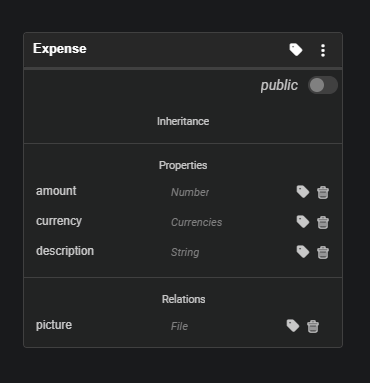
Let's now create a Data Model to describe our expenses.
- Open the Data Folder.
- Create a new Data Model and rename it "Expense Data Model" and double-click to open it.
- Create a new Data Type and rename it "Expense".
- Add following Properties to Expense Model by drag&drop from the Marketplace:
- "String" brick and name it "description";
- "Number" brick and name it "amount";
- "Currencies" brick and name it "currency".
- Add a "File" brick from the Marketplace under
Relationsand rename it "picture".
The end result should look like:
3. Data Logic
Now that we have defined the data model for our expenses, we can think about how we will manipulate those expenses: they need to be created, updated, displayed, etc. To make it very easy to perform those activities once we get to the UI, we create a few helper functions and actions (also called constructors, getters and setters in standard programming terminology).
3.1 Create Expense Action
Let's start with an action to create a new expense. In a nutshell we need to:
- Define the inputs we need to create the expense.
- Create the expense and persist it (i.e. save it in the database).
- Set the description, amount and currency and finally save it in the database.
Luckily, DRAW will make most of the job for us.

- Go back to Data folder.
- Open the "Expense Data Model".
- On "Expense" model, click on the 3 dots icon to open the contextual menu.
- Click on "Generate helper bricks and forms".
- Click on the "Save" button.
- Select "Constructor" and unselect "picture".
- Click on Continue.
- Once the bricks are generated, click on Close.
- Go back to Folder "Data" => A new brick named "Create Expense" was generated.
3.2 Get Expense's Attributes Function
We now create a helper Function to make it easy to retrieve the Expense's values.
- Go to Data folder.
- Open the "Expense Data Model".
- On "Expense" model, click on the 3 dots icon to open the contextual menu.
- Click on "Generate helper bricks and forms".
- Click on the "Save" button.
- Select "Getter".
- Click on Continue.
- Once the bricks are generated, click on Close.
- Go back to Folder "Data" => A new brick named "Get Expense's attributes" was generated.
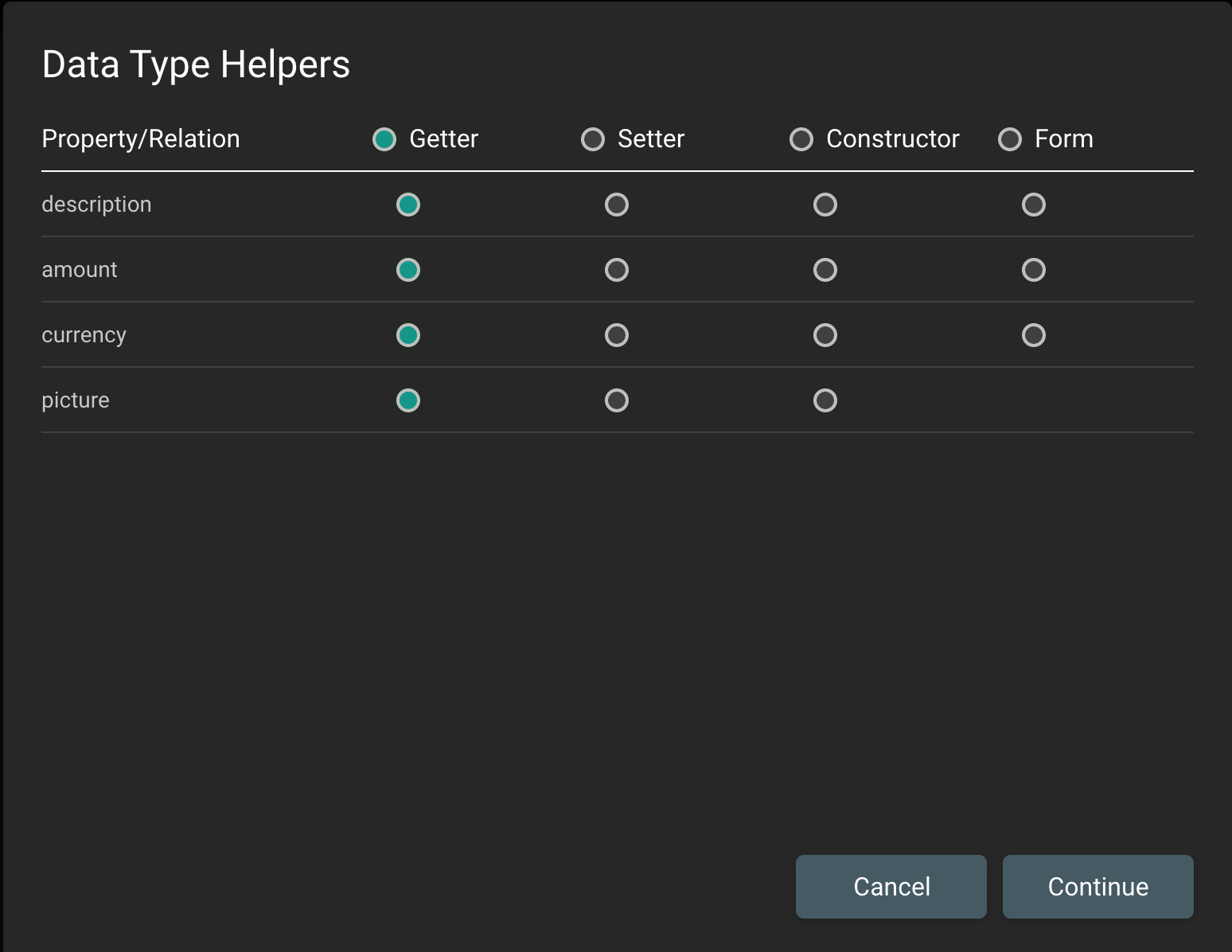
3.3 Set Expense Picture Action
We now create an Action to attach the picture of the receipt to the expense.
- Go to Data folder.
- Open the "Expense Data Model".
- On "Expense" model, click on the 3 dots icon to open the contextual menu.
- Click on "Generate helper bricks and forms".
- Click on the "Save" button.
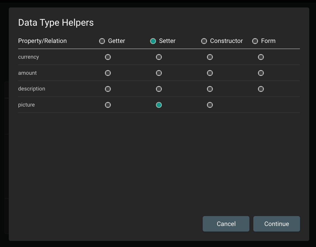
- Select "Setter" and unselect every property except "picture" (see screenshot below).
- Click on Continue.
- Once the bricks are generated, click on Close.
- Go back to Folder "Data" => A new brick named "Set Expense's attributes" was generated.
- Click on the 3 dots icon for the "Set Expense's attributes" and rename the brick to "Set Expense's picture".
3.4 Format Expense function
We now create a helper function that will return a summary of the expense, including the currency, the amount and the description (e.g: USD40-Description).
- Go back to
Datafolder.- Drag&drop a
Functionbrick to create a new Function. Rename it "Format Expense" and double-click to open it.- From the top-left corner, click on the "Add input" button, name it "expense" and set type to Expense from the drop-down list. Click on Add.
- Search in the Marketplace for
Get Expense's attributesbrick and drag&drop it into your function.- Connect the function input "expense" to
Get Expense's attributes"Object" input.- Search in the Marketplace and add two
To Stringfunction bricks.- Search in the Marketplace and add a
Concatfunction brick to concatenate the following texts:
- Connect the "currency" output of
Get Expense's atrributesto s1, placing aTo Stringinbetween;- Connect the "amount" output of
Get Expense's attributesto s2, placing aTo Stringinbetween;- Add another
Concatbrick;- Connect the output of the first
Concatbrick (s1+s2) to s1 of the newly addedConcat;- Click on the "s2" input of the second
Concatbrick and type "-" as a Constant;- Add a 3rd
Concatbrick and connect the output (s1+s2) of the 2ndConcatto s1;- Connect "description" output from
Get Expense's attributesto the s2 input of the 3rdConcatbrick;- From the top-right corner, click on the "Add output" button, name it "summary" and set type to String from the drop-down list. Click on Add.
- Connect output of the 3rd
Concatbrick to the output "summary".
The end result should look like this:

4. UI
We have now defined the data that we will be managing within our application, as well as some helper functions to simplify the manipulation of those data. Similarly, there are some UI components that will be reused across all several screens, so designing them once and for all allows us to reuse them with minimal effort.
4.1 Header
Our app has a Header, which we see on every screen. In order to avoid creating it from scratch on each screen, we now create a reusable UI Component, which we will then be able to drag and drop every time we need it.

- Go back to Project and open the UI folder.
- Search in the Marketplace for
Visual Component. Drag&drop it to create a new Visual Component. Name it "Header" and double-click to open it.- In Properties Panel, click on the 3rd tab. Under Background, set "Color" to black.
- Drag&drop a
Button, rename it as "Header Button" in the Layers Panel, and configure its properties as follows:
- 1st tab: Text = "< Back"; Variant = "Outlined"
- 2nd tab: X = -6, Y = Middle (select from the drop-down arrow), Width = 85;
- Drag&drop a
LabelUI Component, rename it as "Header title" in the Layers Panel and configure its properties as follows in the Properties Panel:
- 1st tab: Text = "Title"; Text Variant = Heading 5; Horizontal Align = "Center"
- 2nd tab: X = Center, Y = Middle (select from the drop-down arrow);
- Drag&drop a "Rectangle" and configure its properties as follows:
- 2nd tab: X = Left, Y = Bottom, Width = 100% (use the dropdown menu to switch to %), Height = 6
- 3rd tab: Background color = select the predefined grey
The text of our button and title will not be the same on all screens. Similarly, when we click on the header different things may happen depending on the screen. We therefore want to be able to customise our component a little bit each time we use it. This is done in four steps:
- Define a
Context. - Set the value of the title.
- Determine whether the Back button is visible or not.
- Trigger an event from the Back button when we click on it.
1. Define the Context of our Visual Component
Each Visual Component (and screens as well by the way) can have a Context, i.e. a set of parameters and events that are available from outside the component. In our case, we want to configure the Header Button visibility and the Header Title text. Also, when the button is clicked, the component must notify its parent.
On the top of the Editor, click on "Spec & Doc" tab.
- Add two "Properties" by clicking on the "New" button with the following:
- Name the first property "Hide Button". Select the Type = Boolean from the drop-down list;
- Name the second property "Title". Select the Type = String from the drop-down list;
- Add also an "Event" and add the following:
- Name it "On Back".
2. Set the text of the Title
On the top of the Editor, click on "Visual Editor" tab.
- From the Layers's tree, select the "Header title" label.
- In properties panel, 1st tab, under "Text", create a function by clicking on the
f(x)button and configure it as follows:
- At the left of the screen, under Property Picker, drag the "Header" component and drop it to the Function body (empty rectangle in the middle of the screen).
- Search and select property "Title (String)" (that's the one created previously) and click on "Get Value".
- Connect the "Get UI Property" Value output to the "Text" output.
- Close the function.
Set the visibility of Header button
- Go back to the Header's Visual Editor and select from the Layers's tree the button and name it "Header button".
- In properties panel, 3rd tab, under Visibility, clik on the
f(x)next to the "Hidden" toggle.- Drag the "Header" component and drop it to the Function body.
- Search and select property "Hide Button (Boolean)" and click on "Get Value"
- Connect the
Get UI Property"Value" output to the "Hidden" output.- Close the function.
Raise the event when the button is clicked
- Go back to the Header's Visual Editor and from the Layers's tree, click on the "Header button".
- In the properties panel, 4th tab, create an action for Interaction "On Click" by clicking on the
f(x)button and configure it as follows:
- Drag&drop the
Dispatch Eventbrick onto the screen from the Marketplace.- Connect the "Control Flow" input to the
Dispatch Event"Control Flow" input;- Click on the "Event" input of the
Dispatch Eventand click on the Target icon under "Constant";- A new Editor will open. Click on "Header" in the Current's tree and select "On Back (UI Event)". Confirm it by clicking on the "Dispatch" button.
- The screen returns to the Control Flow. Close the action.
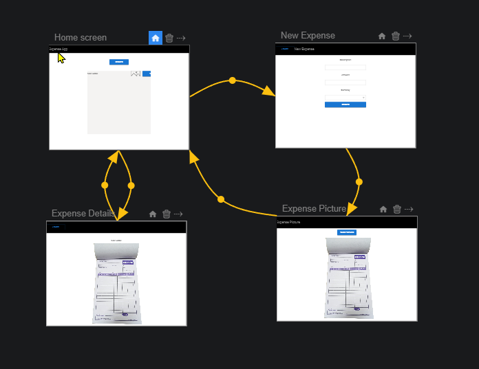
5. App
5.1 Expense App
We have now built the plumbing for our application: we have a data model and helper functions to manipulate the data, and we have a reusable header component. Let's now create the Expense App and start plugging the different parts together.
- Go back to the Expense Project.
- Search in the Marketplace for the
UI Appbrick.
- Drag&drop it to create a new UI App.
- Name it "Expense App" and double-click to open it.
OPTIONAL: Run the app on another tab or on a mobile device using the two little buttons at the top-right of the editor next to the marketplace.
5.2 Home Screen
Let's start with the Home screen of our app. The home screen consists of:
- The header we built above;
- A button to create new expenses;
- A list of existing expenses with a button to open one and see its details.
- Double-click on the Home screen to open it.
- Search in the Marketplace for the
HeaderVisual Component you just created and drag&drop it. Drag&drop also aButtonand aListbricks.- Click on the "Home screen" in the Layers's tree:
- 1st tab: Layout = Vertical, Spacing = 60
- Using the Layers's tree, reorder the elements to have the New Header at the top by drag&dropping.
- Click on the "New Header" in the Layers's tree, rename it as "Header" and configure it as follows:
- 2nd tab: Height = 90, Width = 100% (using menu to switch to %)
- 1st tab: Title = "My Expenses", Hide Button = True (switch the toggle)
- Click on the "New Button" in the Layers's tree, rename it as "New Expense Button" and configure it as follows:
- 2nd tab: Width = 200
- 1st tab: Text = "Create Expense"; Variant = Contained; Color = Primary; Font Size = Medium
- Click on the "New list" in the Layers's tree, rename it as "Expense List" and configure the list as follows:
- 2nd tab: Width = 90%, Height = 570 (or if you feel confident, you can even define a function to make it grow automatically depending on the size of the screen!)
- 1st tab: Item Width or Height = 60; Spacing = 10

Configuring the list of expenses
We now want to display the list of expenses. This is done in two steps:
- Get the list of expenses which we want to display.
- Configure each line of the list to display the expense as we want it.
Select the "Expense list" from the Layers's tree and configure it as follows:
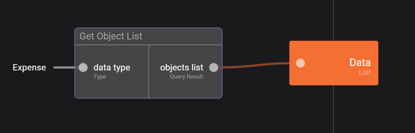
- 1st tab: Data = Click on the
f(x)button to create a function which returns all Expenses using theGet Object Listbrick. See screenshot below and the steps in doing so:
- Search in the Marketplace for
Get Object Listbrick and drag&drop it onto the screen;- Click on the "data type" input and select "Expense" from the drop-down list;
- Connect the "objects list" output to the "Data" output.
And now we can display an expense in the list:
- Go back to the Home Screen.
- From the Layers's tree, click on "Expense List". In the 1st tab, click on the "Item Renderer" "Create" button. This will define content to be displayed on each lines (Expense details).
- Add a new
Labelbrick from the Marketplace and rename it "Summary" in Layers's Editor.
- 2nd tab: X = Left, Y = Middle (selectable from the drop-down arrow);
- 1st tab: Text: Create a function which returns the summary of the expense (see below image).
- Click on the
f(x)button next to the "Text" property.- From the Prop picker's tree, drag&drop "Expense List_Item Renderer" onto the screen.
- Select "Current Item (Object)" and confirm with "Get Value" button.
- From the Marketplace, drag&drop the
Format Expensebrick.- Link the
Get UI propertyoutput (Value) to theFormat Expense(Expense) input.- Link the
Format Expenseoutput (Summary) to the orange "Text" output.- Go back to the "Item Renderer" from the breadcrumb menu. Drag&drop a
Button, rename it as "View button" and configure it as follows:
- 2nd tab: X = Right, Y = Middle, Width = 100;
- 1st tab: Text = "View"; Variant = Outlined;
- Close the list item renderer.
- Back to the Item renderer view, let's add an
Imagebrick.
- 1st tab: Click on the
f(x)next to the "Image" property.
- From the Prop picker's tree, drag&drop "Expense List_Item Renderer" onto the screen.
- Select "Current Item (Object)" and confirm with "Get Value" button.
- From the Marketplace, drag&drop the
Get Expense's Attributesbrick.- Drag&drop the
Get First Object in Listbrick.- Link the
Get UI Propertyoutput (Value) to theGet Expense's attributesinput (Object).- Link "picture" to the input of
Get First Object in List(Object list).- Link
Get First Object in Listoutput to the "Image" output.- Go back to the "Item Renderer" from the breadcrumb menu and select the Image and the Button
- Group them by using the "Group selected elements” button on the refactoring tools ribbon above the Layers.
- Select the group, edit it and in the 1st tab of its properties, locate the Layout property
- Set the Group's Layout to be Horizontal, Y = Middle, X = Right in the 2nd tab of Properties, and arrange its components so it looks like this


You can find here an example on how to retrieve the current value of a list item renderer.
We will configure the "View" button a bit later in the tutorial. We need a few expenses to test that the list is properly configured. Before being able to create them from the application, we can create one or two expenses using the same dataset that we used to create the currencies.
5.3 New Expense Screen
Now that we are done with the Home screen, let's look at the screen which we open when clicking on "Create an expense" button in the Home screen.
This is the New Expense screen. It consists in:
- A header;
- A text field to set a description;
- A text field to set the amount;
- A dropdown to set the currency;
- A button to confirm and create the expense.

Let's first create the screen and make it reachable from our Home screen:
- Go back to Expense App at the Screenflow Editor tab.
- Add a new Screen from the Marketplace and name it "New Expense".
- Click on the arrow next to the Trash icon's Home Screen. Drag & drop towards the New Expense screen to create a transition between the Home screen and your new screen.
- Click on the dot in the middle of the transition to edit it.
- Next to "Event", click on the + button, this will display the home screen.
- Click on "Create an expense" button, select "On Click (UI Event)" and click on
Dispatch.
If you have the app running you should be able to click on the button to go to your new screen. We can now add the different UI elements:
Open the new screen.
- In the 4th tab, set Layout = Vertical, Spacing = 10;
- Add a "Header" UI Component from the Marketplace and configure it as follows:
- 2nd tab: Height = 90, Width = 100%;
- 4th tab: Title property from context editor = "New Expense"
- Add three Labels, two TextFields and one DropDown bricks from the Marketplace:
- Use the Layers's tree on the left to reorder the components to build a proper form.
- For each Text Field set Width 300 in the 2nd tab.
- In the tree, click on the little pencil icon to rename what we just added:
- The labels as "Description label", "Amount label" and "Currency label"
- The text fields as "Description", "Amount"
- The drop down as "Currency"
- Set the label Text to "Description", "Amount" and "Currency" for each label (1st tab)
- Select the Amount text field and configure it as follows:
- 1st tab: Type = Number from the drop-down list
- Select the Currency dropdown and configure it:
- 1st tab click the
Enumdropdown and choose the "Currencies" item- Add a Button brick from the Marketplace:
- 1st tab: Name = "Create Button";
- 2nd tab: Width = 300;
- 4th tab: Text = "Create";
- Use the Layers's tree to put the New Label and Create button at the bottom.
- To improve the view you may additionally add an empty label 'spacer' between the button and the dropdown:
- Add a new label
- Position it between the Create button and the Currencies Dropdown
- Remove the default "New Label" text in the 1st tab
- Click on the "New expense" from the Layers's tree:
- 4th tab: Enable Vertical Scrolling toggle.
The final part is to actually create the expense once we click on the button. However, we actually need to do a bit more than that; clicking on the button has to:
- Create the expense
- Move to the next screen that will allow us to take a picture of our receipt
- Make sure that the next screen has the expense that we are just creating, so that it can attach the receipt to it
- On the current view, click on tab "Spec & Doc".
- Add a new "Event" and name it "On Create".
- Add a new "Property", name it "New Expense" and set type to "Expense".
- Click on tab "Visual Editor".
- Select the "Create Button":
- 4th tab: Add a function to the "On Click" button from the f(x):
- Add "Create Expense" brick from the Marketplace and connect its Control Flow to the Control Flow input;
- On the left, under Prop Picker, drag&drop Amount. Select property "Value (Text)" and click on "Get Value";
- Under Prop Picker, drag&drop Description. Select property "Value (Text)" and click on "Get Value";
- Under Prop Picker, drag&drop Currency. Select property "Selected Value (Object)" and click on "Get Value";
- Connect the Get UI Property bricks value outputs to the appropriate inputs of the Create Expense brick;
- Under Prop Picker, drag&drop "New Expense" and select property "New Expense" and click on "Set Value". Connect the Control Flow between "Create Expense" with the Control Flow of the "Set UI Property". Link "Create Expense" object with the Set UI Property Value input.
- Add "Dispatch Event" brick from the Marketplace:
- Connect its Control Flow with the Control Flow of "Set UI Property".
- On "Dispatch Event", click on Event input, then on the target icon under Constant. This displays the screen.
- Click on New Expense Screen (in the Layers's tree). Select "On Create (UI Event)". Click on "Dispatch".

5.4 Expense Picture Screen
So far, we have created a Home screen, as well as a New Expense screen that allows creating a new expense. What we now want to do is to take a picture of the receipt, and attach it to our expense. We do this in a new screen, which is displayed when we click on the "Create" button in the New Expense screen. Our Expense Picture screen therefore consists of:
- A header
- A video which displays the camera
- A button to take the picture of the receipt. When the picture is taken, we go back to the Home screen.

Let's start by creating our new screen, and connecting it to the New Expense screen. We also need to make sure that the expense created in the New Expense screen is transferred to the Expense Picture screen so that we can link the two together.
- Go back to Expense App by clicking it in the breadcrumb. We end up in the Screenflow Editor.
- Add a new Screen brick from the Marketplace, name it "Expense Picture" and open it by double-clicking it.
- Click on tab "Spec & Doc".
- Add a "Property", name it "Expense" and set type to Expense.
- Add an "Event" and name it "On Picture Taken".
- Go back to the Expense App's Screenflow Editor again (click in the breadcrumb).
- Create a transition between the New Expense screen and Expense Picture screen.
- Click on the dot in the middle of the transition to edit it.
- Under Event, click on "None" and select "On Create".
- Click on Property Mapping and connect "New Expense" and "Expense" by holding the left click of the mouse on New Expense towards Expense.
We can now build the UI of the screen.
- Double-click to open the Expense Picture Screen. Set the screen's "Layout" (1st tab) to "Vertical". And set "Spacing" to 10. Add a "Header" brick from the Marketplace and customize it as follows:
- 2nd tab: X = 0, Y = 0, Height = 90, Width = 100%
- 4th tab: Title property from context editor = "Expense Picture", Hide Button = true by enabling the toggle
- Add a "Button" brick from the Marketplace:
- 1st tab: Name = "Take Picture Button"
- 2nd tab: X = Center, Y = Bottom
- 4th tab: Text = "Take Picture"
- Add a "Camera" brick from the Marketplace:
- 1st tab: Name = "Camera Preview"
- 2nd tab: X = Center, Y = 90, Width = 90%, Height: click f(x) to completely fill the space between the header and the Take Picture Button:
 * From the Prop picker, drag&drop the "New Header", select "Height" and "Get Value".
 * Next, drag&drop the "Take Picture Button", select "Height" and "Get Value".
 * Add from the Marketplace a `Plus` brick and connect the outputs of these two Get UI property to a and b inputs.
 * Drag&drop Expense picture, select "Height" and "Get Value".
 * Drag&drop another Plus brick.
 * Link the first `Plus` brick's "a+b" output to the next "Plus" brick's "a" input.
 * Set 20 on the next Plus brick's "b" input (this is to deduct not just the screen height, but also 2 times the Spacing value).
 * Drag&drop a `Minus` brick from the Marketplace.
    Connect the Value of the latter Get UI property to "a", and the output of the latter Plus brick to the "b" input of the Minus brick.
 * Final step is to connect the output of Minus to the Height in orange.

- Go back to the Expense Picture screen and click on Take Picture Button, go to 4th tab and click on the f(x) button for "On Click" Interaction.
- Under Prop Picker, drag&drop "Camera Preview", click "Events" and select "Take Screenshot (UI Event)" and click "Dispatch".
- Under Prop Picker, again drag&drop "Camera Preview" and select "Screenshot (File)" in the Properties list. CLick "Get Value",
- Under Prop Picker, drag&drop "Expense Picture", select "Expense(Expense)" property Click on Get Value.
- Drag and drop a `Persist Object`` brick.
- Now link the Control Flow from the action input to the Dispatch event and then to the Persist object input.
- Link Get UI Property's 'Value' output to the
Persist object's 'object' input. This will take a screenshot and persist it. - Drag&Drop 'Expense Picture' from the Prop Picker panel on the left.
- Add
Set Expense's picture' brick from the marketplace and select 'Expense (Expense)'. Click 'Get Value' - Link the control flow from
Persist object`` toSet Expense's picture`. - Link Persist object's 'object' output to the 'picture' input of the `Set Expense's picture brick.
- Link the latter Get Ui property brick's output "Value' to the
Set Expense's Picture's 'Object' input. - Add another
Persist Objectbrick. Link theSet Expense Picture's outputs to the corresponding inputs of the latterPersist Object' inputs. - Finally, add
Dispatch Eventbrick from the Marketplace, link the Control Flow between 'Persist Object' and `Dispatch event`` and set "Event" to Expense Picture's "On Picture Taken".

Now, since after we take a picture we want to go back to the Home screen, we need to add a transition in the app's Screenflow Editor.
- Go back to Expense App by clicking on "Expense App" in the breadcrumb(Screenflow Editor).
- Create a transition between Expense Picture screen and Home Screen and select event "On Picture Taken" by clicking on the trasition's dot.
5.5 Expense Details Screen
So we have covered most of our application: we can create new expenses, attach receipts to them, and view the list of expenses created. The final step is to be able to view the details of an expense when we click on it.
We can therefore now go back to the Home Screen and configure the "View" button to trigger an event when clicked, and record which expense is being viewed.
In "Spec & Doc" of the Home Screen:
- Add an "Event" and name it "On View Expense".
- Add a "Property", name it "Selected Expense" and set its type to "Expense".
- Go to "Visual Editor" tab and open the list item renderer (1st tab: click 'Edit' for the Item Renderer' property) .
- Select the "View Button" button and on the 4th tab, configure its "On Click" interaction by clicking on the f(x) button next to it:
- Under Prop Picker, drag&drop Item Renderer, select "Current Value (Object)" property. Click on "Get Value".
- Under Prop Picker, drag&drop Home Screen, select "Selected Expense (Expense)" property. Click on "Set Value".
- Connect "Get UI Property" value output to "Set UI Property" value input.
- Connect Action Control flow output to "Set UI Property" Control Flow input.
- Add "Dispatch Event" brick from the Marketplace. Set Event to Home screen's "On View Expense".
- Link the control flow from the "Set UI property" to the control flow of "Dispatch Event".
- Close the action.

We now build a new screen to view the details of an expense, the Expense Details screen. This screen is displayed when clicking on one of the "View" buttons in Home screen. It contains:
- A header
- A label to display the description
- A label to display the amount
- A label to display the currency
- A picture to display the receipt picture.

Like we did between the 'New Expense' screen and the 'Expense Picture' screen, we need to provide the 'Expense Details' screen with the expense that we clicked on in the Home screen.
- Add a new Screen, name it "Expense Details" and open it.
- Click on tab "Spec & Doc".
- Add a "Property", name it "Expense" and set its type to Expense.
- Go back to Expense App (Screenflow Editor).
- Create a transition between Home Screen and Expense Details Screen.
- Click on the transition's dot and set the event to "On View Expense" and under Property mapping, map the property "Selected Expense" to "Expense".
Let's now build the UI.
- Open Expense Details Screen.
- Add a "Header" UI Component from the Marketplace and configure it as follows:
- 2nd tab: X = Left, Y = Top, Height = 90, Width = 100%
- 1st tab: Title property from context editor = A function that retrieves the expense's Description from the screen's Expense property (use Get Expense's attributes from the Marketplace). you can implement the Header's "title" property like this, for example:
- Or else you can hardcode a constant name for the title right in the 1st tab, like, 'View Expense'.
- Close the logic editor for the title if you opened it.
- Add a "Label" UI Component and configure it as follows:
- 2nd tab: X = Center, Y = 120
- 1st tab: Horizontal Alignment = Center, Text = click on the f(x) button to create a function which displays the summary of the expense (using "Format Expense Summary").


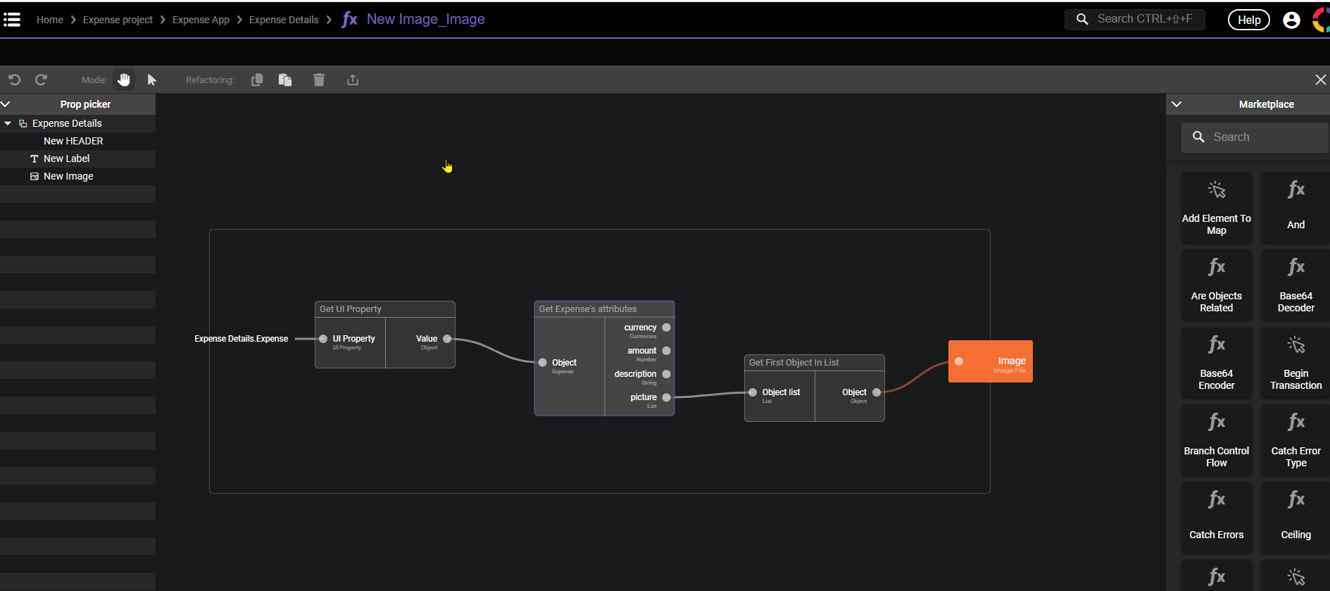
- Add an "Image" UI Component and configure it as follows:
- 2nd tab: X = Center, Y = 180, Width = 80%, Height = 400
- 1st tab: Image = Function which calls "Get Expense's attributes" to retrieve the "Picture" property

And finally we allow the user to go back to the Home screen.
- Go back to Expense App by clicking on 'Expense App' in the breadcrumb (Screenflow Editor).
- Create a transition between Expense Details Screen and Home Screen. Click on the dot, create a new event (+ Button), click on Header and select "On Back (UI Event)".