Themes
A theme represents a set of values that directly impact the visual appearance of components.
- For example a theme defines the Primary Color that should be used by components (for example orange)
- And Visual Components use those values when rendered on the screen. For example a Button will be orange if the Primary Color is orange.
Internally the Themes use the Contexts feature. It can be helpful to read the context documentation if you are not yet familiar with it.
Using themes
- First you need to create one or several themes in your project
- Then you must set a theme for your application
- You might want to use theme properties in a custom Visual Component
- Optionnally you can use several themes in different parts of your application
If you don't provide a theme, the Core components will work with a default appearance. Using Themes is not mandatory for a project.
Create a Theme in a project
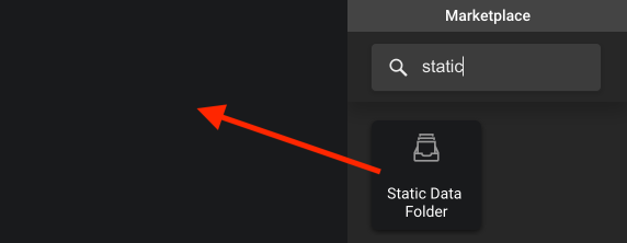
Themes are registered in your project using a Static Data Folder.
- Create a Static Data Folder

- You can then give a name to this static folder and open it
- Click the + button to create a Theme instance

- Set the Theme's properties according to the desired visual appearance

Copy the tag of the theme you would like to use in your application.
Set a Theme for an application
You can set the Theme for an application from anywhere in your app. However, the best place to do so is in the Properties tab of the UI App.
- Open your UI app where you want to set a theme
- Navigate to the Properties editors and open the
On Loadf(x)

- In this editor, branch the following bricks like in the image below.

That's it ! Now all the Visual Components in your app will use the Themes properties from the theme you have assigned.
Use the them tag you copied above as input value for the Get Object By Tag brick.
You must use the On Value brick to ensure that the Get Object By Tag brick returns the correct value before setting the theme in the Application Context.
Use a Theme in a custom Visual Component
Imagine you are building an application with a custom Header Visual Component. You might want this header to use the current Primary Color of the application (based on the current theme). This can be achieved by:
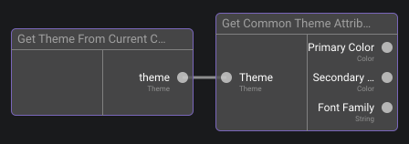
- using the Get Theme From Current Context brick which will return the currently assigned theme instance
- and using a Get Object Property brick to get the desired property

Alternatively you can use the Get Common Theme Properties brick when you want the Primary Color, Secondary Color or Font Family

Visual Example
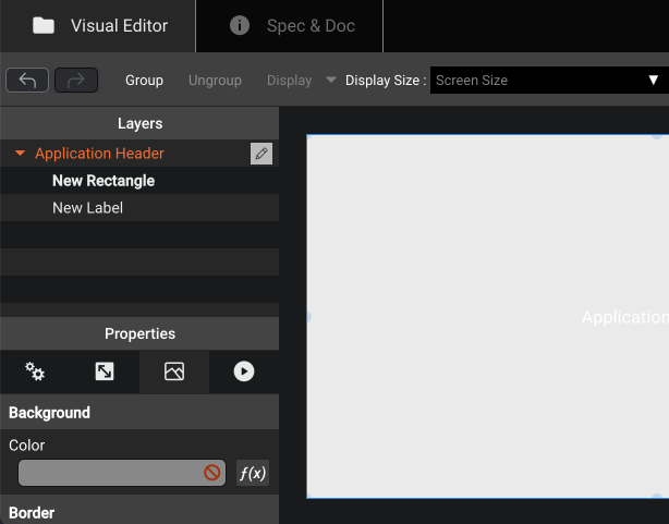
| Visual Component | Function to define the background color | |
|---|---|---|
 | → |  |
| The background property is defined by f(x) | And the value of the background color is retrieved by the theme currently assigned in the context |
Apply a different theme to a subpart of your application
So far we have seen how to use Themes at the application level. This will change the visual appearance of all visual components in the application in the same way. Now if you need to set a specific theme for a particular area of your application, you can granularly set a theme in this context.
- Open the "On Load" f(x) of the Component that must use a specific theme
- In this function editor, use the Set Theme In Parent Context to set the desired theme in the context of the whole component.
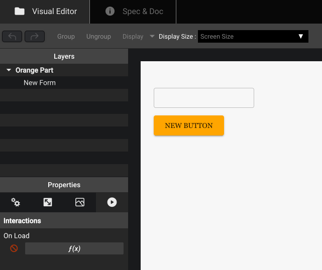
| Visual Component | Function to set the custom theme | |
|---|---|---|
 | → |  |
| Use the On Load f(x) | Assign a specific theme for this component |
You might be tempted to use the Set Theme in Current Context in the On Load above. However this will assign the theme in the Context of the On Load function, which is a child context of the component. If the purpose is to make the whole component react to the specified theme, you must assign it to the parent context.